Adding Figures in R Markdown
This chapter is optional. I may refer to it elsewhere as a reference guide for adding plots and figures in R markdown.
In this chapter you will learn how to insert a figure in an R markdown (.Rmd) file. You can use this chapter as future reference for when you want to include figures in later chapters.
Image from a File (simple)
The simplest way to include a figure is by writing anywhere outside code chunks (in the white space):

In case the image is saved in the same folder as your R markdown file, this simplifies to:

(Replace image by the name of your file. Replace extention by whatever file extension your image has, like JPG, PNG or BMP.)
This method is fine when you just want to include an image as is and don’t care about anything else.
For example, in the folder of my R markdown file, I have a subfolder figures with an example image called pollenSEM.jpg.
Writing 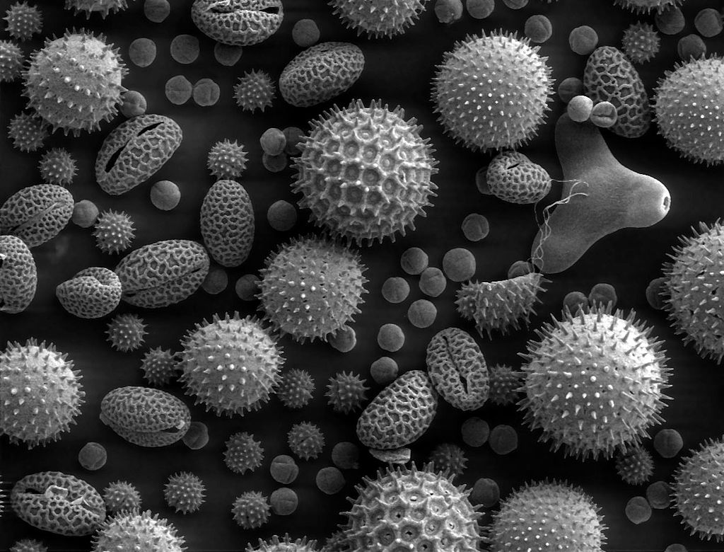 will include this image with a caption:

An image of pollen under an SEM. From: https://w.wiki/gv8
Exercise 1
Include an image of your liking to your R markdown file using the method described above. For your own convenience, I recommend saving both the Rmd file and the image in the same folder. Knit your file to see if the image renders correctly.
If you want to resize the image, check the next section.
Image from a File (advanced)
For greater flexibility, include figures using include_graphics(). To use this function, you have to place it in a code chunk. For example:
```{r  label = pollen, echo = TRUE, fig.cap = "Image of pollen under an SEM. From: https://w.wiki/gv8", out.width = '20%'}
knitr::include_graphics("figures/pollenSEM.jpg")
```
Figure 7.1: Image of pollen under an SEM. From: https://w.wiki/gv8
Here I have set echo = TRUE, so that you can see the code that produced the figure. Usually, you will want to hide this code in a report. You can set echo = FALSE to suppress code in the output.
(For those interested, a comprehensive list of chunk options is described here.)
Adding a caption with the fig.cap argument automatically numbers the image. In addition, it allows for cross-referencing, using \@ref(fig:...). Simply replace ... with the label you wrote for the chunk containing the image. For example, if I write \@ref(fig:pollen), you will see: Figure 7.1. The 3 here refers to the chapter number and .1 refers to the first image in this chapter.
Exercise 2
Using the advanced method, insert your figure from exercise 1 with a smaller size, using a new code chunk. Then, add a sentence below the chunk referencing the image using \@ref(fig:...).
Plots Drawn in R
Of course, you can also include plots generated by R code. Below are some examples.
Simple Example (Linear Relationship)
x <- 0:10
y <- -5 + 2 * x
plot(y ~ x, type = "l", main = "Linear Relationship")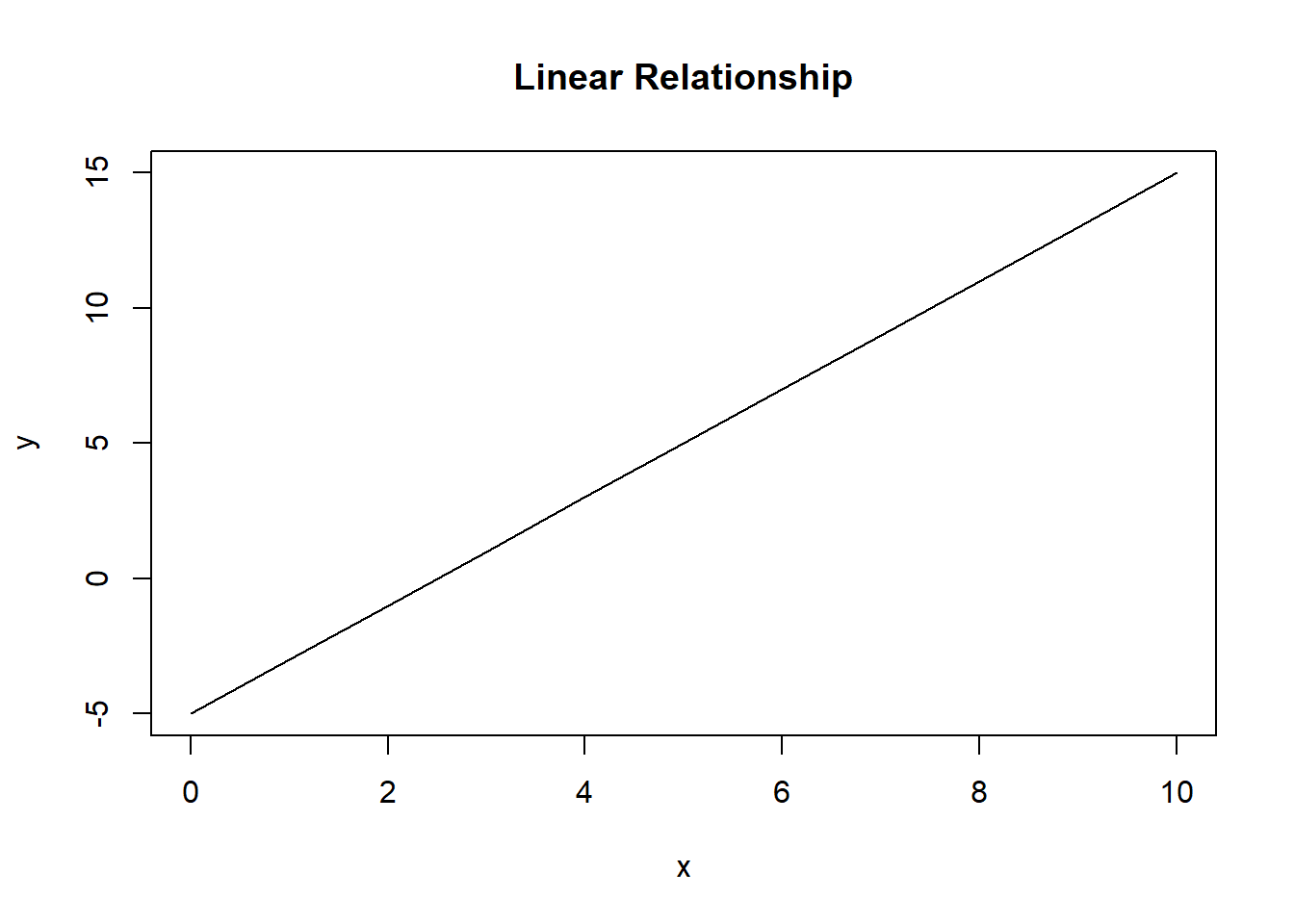
Figure 7.2: A linear relationship
You can change the \(x\) and \(y\) axis range by using xlim and ylim, respectively:
x <- 0:10
y <- -5 + 2 * x
plot(y ~ x, type = "l", main = "Linear Relationship", xlim = c(0, 7.5), ylim = c(0, 10))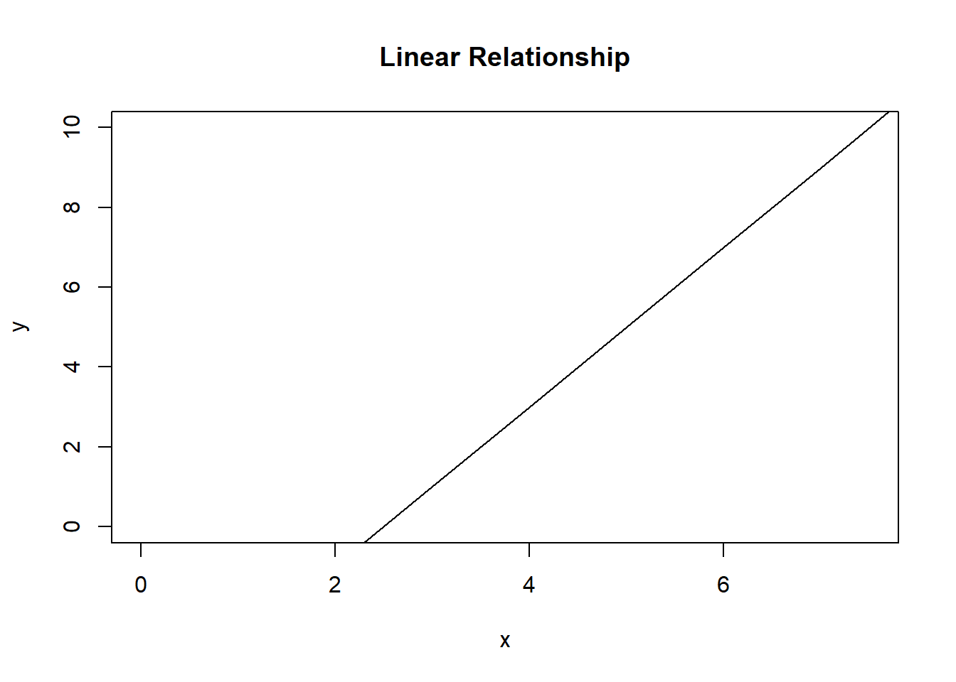
Figure 7.3: A linear relationship
In fact, you can change virtually anything about the plot. You may skip this part if that doesn’t interest you. We will go into detail about this later in the portfolio, but here is a quick example:
x <- 0:10
y <- -5 + 2 * x
plot(
  y ~ x,                  # Where to plot
  type = "b",             # What to plot (both points and linepieces)
  main = "Custom plot",   # Title
  ylab = "y-values",      # Y-label
  xlab = "x-values",      # X-label
  font = 2,               # Axis font (bold)
  pch  = 19,              # Point character (solid)
  cex  = 2,               # Character expansion factor
  lty  = "dashed",        # Line type
  lwd  = 3,               # Line width
  las  = 1,               # Perpendicular axes
  bty  = "n",             # No box around the plot
  col  = "steelblue",     # Change the color of what is plotted
  col.main = "darkblue",  # Color of the title
  col.lab  = "gray",      # Color of the labels
  col.axis = "darkgray",  # Color of the axes
)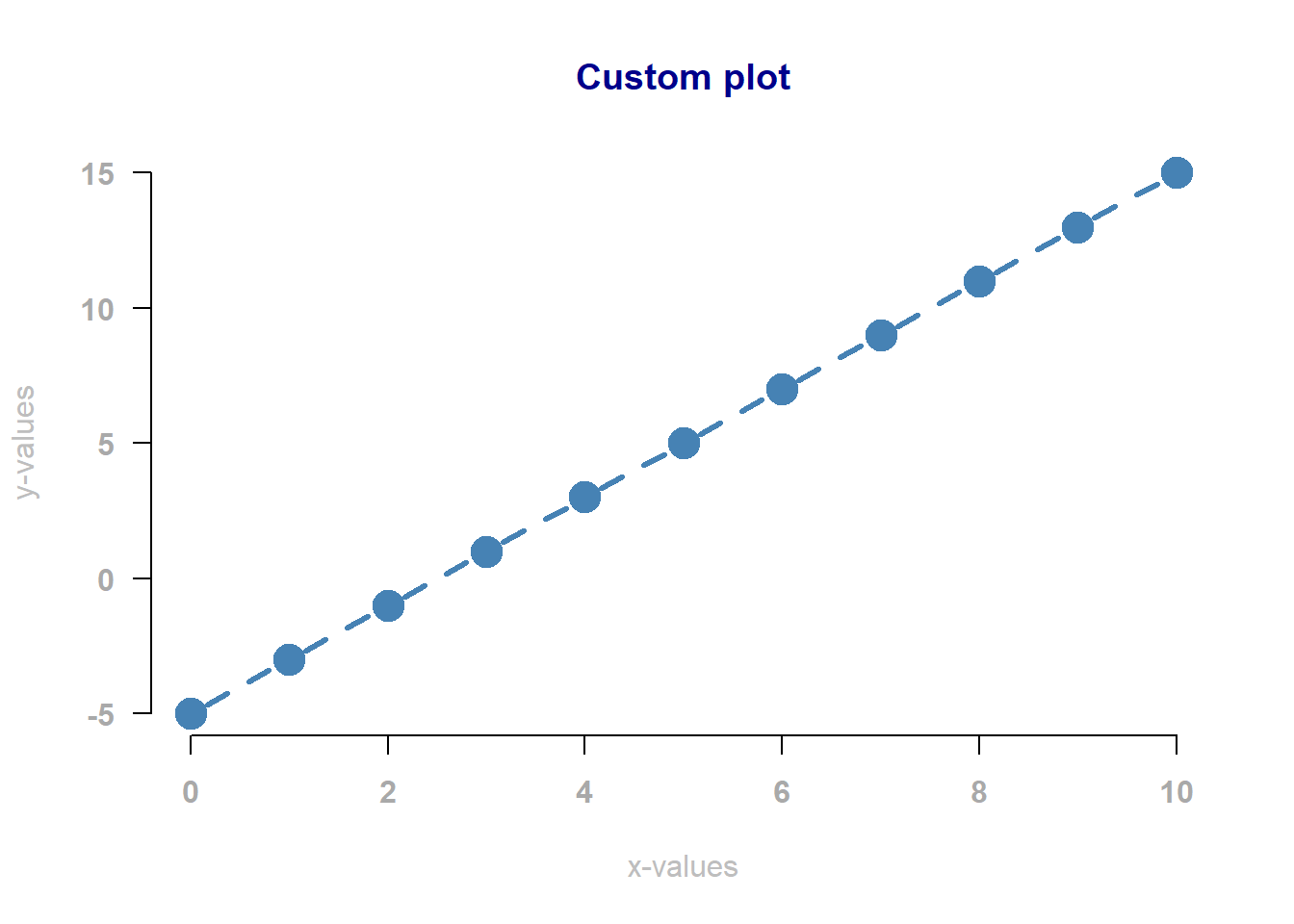
Figure 7.4: A linear relationship
If you like changing plots, you can find many more settings in the help page for par.
Multiple Plots in One Area
You can also add multiple plots to a single plotting area, using par:
par(mfrow = c(2, 3)) # Two rows and three columns (6 plots)
plot(Sepal.Length ~ Sepal.Width,  data = iris, main = "Sepal Length vs Sepal Width")
plot(Sepal.Length ~ Petal.Length, data = iris, main = "Sepal Length vs Petal Length")
plot(Sepal.Length ~ Petal.Width,  data = iris, main = "Sepal Length vs Petal Width")
plot(Sepal.Width  ~ Petal.Length, data = iris, main = "Sepal Width vs Petal Length")
plot(Sepal.Width  ~ Petal.Width,  data = iris, main = "Sepal Width vs Petal Width")
plot(Petal.Length ~ Petal.Width,  data = iris, main = "Petal Length vs Petal Width")
par(mfrow = c(1, 1)) # Restore the default (1 plot)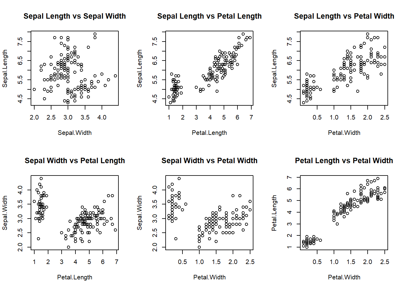
Figure 7.5: Four variables in the iris data set plotted against each other.
Here I used par(mfrow = c(2, 3)) to create a grid of 2 by 3 plots. I had to include the data argument to tell R where to retrieve these variables (a standard data set in R). I included the last line to restore the default settings. If you ever change a setting and forget the default, either look at the par help page, or just restart RStudio.
Exercise 3
The code below generates data for a logarithmic, exponential and quadratic relationship.
x  <- seq(1, 10, 0.01)
y1 <- -5 + 2 * log(x)
y2 <- -5 + 2 * exp(x)
y3 <- -5 + 2 * x^2
Copy the code above to a new chunk in your Rmd file and plot x against y1.\(^\dagger\) Then create two more plots, where you plot x against y2 and x against y3. Use par(mfrow = c(..., ...)) to arrange these plots side by side. Within each call to plot, use the main argument to give each plot a title. Feel free to try and adjust other graphical parameters!
\(^\dagger:\) You don’t need the data argument here, because if you run the code above, the objects will be stored in the workspace.
Exercise 4 (*)
For those seeking an extra challenge, let’s create a plot of a bacterial growth curve:
- First, there is a lag phase where no growth is observed;
- Then, growth enters an exponential phase;
- At some point, space and resource scarcity kick in and growth slows down to a stationary phase (no growth);
- Finally, resources are slowly, but surely exhausted and a negative growth takes place (death phase).
Create a plot that shows each of the four phases. You can use the function lines to draw separate pieces of the curve, if you find that easier.